Marsho: Health Drink


My Role
Position: Web Designer, Brand Designer
Tools: Adobe Dimension, HTML, CSS
Project Type: Web Design, Branding
Timeline: 1 Month, April 2024
Problem Statement
Problem: Create a personal project in HTML/CSS
Solution: Marsho is a fictional health drink brand designed for health-conscious consumers who value ingredient transparency, modern branding, and nutritious options. This project explored technical web development and branding, showcasing my skills in HTML/CSS and aesthetic presentation.
Research & Inspiration
“I designed for people who care about what goes into their drinks, appreciate modern packaging, and want clarity and trust in what they’re buying.”
-
Targeted health-conscious consumers who value transparency & aesthetic simplicity
-
Researched real wellness brands (e.g., Synergy Kombucha, Recess)
-
Conducted usability testing on high-end artisanal lamp sites to learn from visual hierarchy & nav clarity
-
Observed patterns: minimal navs, intuitive categories, generous white space, simple language
Insight: Users want to feel invited, not sold to. The site should feel like a calm, modern store, not a loud ad.
Moodboard & Branding
-
Subtle psychedelic meets modern wellness
-
Aura tones, soft gradients, clean layout
-
Logo in bold font for contrast
-
Minimalist structure so product imagery speaks first

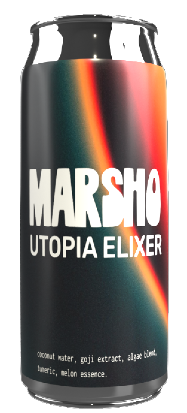
Adobe Dimension
Designed & rendered cans to match brand personality.


Ideation
I began sketching layout concepts to explore content hierarchy and placement of visuals across screen sizes.
Very *rough* sketches.

The Landing Page
(HTML {styles} and <tags> are placed throughout the sketches)
The Ingredients Page
This page provides transparency on how "our" ingredients are ethically sourced.


Mobile View of the Homepage
Introduces hamburger nav 🍔.
Final Outcomes
Desktop View


Mobile View
Feedback
What Users Liked
-
Clean, calming design that feels trustworthy
-
Easy-to-navigate layout on both desktop and mobile
-
Ingredient transparency and health benefit details
-
Modern can visuals that match the brand’s tone
What Could Be Improved
-
Add more product descriptions
-
Refine mobile navigation, some text was formatted unnaturally
-
Make backgrounds fit the page, the repeating background isn't cohesive.
What I Learned
-
Do media queries first to avoid a confusing CSS page.
-
Focus on mobile optimization! Mobile navigation is one of the most primary means of access present day.
-
Basics of JavaScript
-
I enjoy consumer-facing web design.